
OptIn
A mobile app for organizing pickup sports by group vote, taken from concept through to a live working web app
Role: Solo Designer & Developer
Timeline: January to April 2026
Tools: Figma, Figma Make, Notion, React, Supabase, Claude Code, Figma MCP, Vercel
Course: CPFN 542, Design for Mobile Devices, Toronto Metropolitan University
The Problem
Organizing a pickup volleyball game usually starts in a group chat and ends nowhere. You text six people, thirty messages later nobody knows the time or the court, half the group has muted the thread, and the game quietly dies.
Group chats give you no way to put several options side by side and no way to tally who is actually coming. Details like venue cost and headcount get buried in the scroll.
How might we give recreational athletes a structured, low-friction way to agree on when and where to play?
The app is aimed at recreational athletes and the people who usually end up doing the organizing, roughly ages 18 to 45. Community center managers and amateur league coordinators are a secondary audience.
Why Existing Tools Fail
| Tool category | Gap |
|---|---|
| Group chats (iMessage, WhatsApp) | No structure, so logistics get buried in the thread |
| Generic schedulers (Doodle, When2Meet) | No sports context, no cost splitting, no persistent groups |
| Sports apps (TeamSnap) | Built for organized leagues with fixed rosters, not casual pickup |
OptIn is built specifically for recreational pickup sports and puts scheduling, voting, cost logistics, and group management in one mobile-first app. The voting mechanic is what separates it from a generic scheduler: instead of one organizer deciding for everyone, the group converges on the option most people can actually make.
The Core Loop
Everything in the app hangs off a four-step loop.
- Organize. Create a game with up to five time and location options, set costs, invite players.
- Vote. Players tap In, Maybe, or Out on each option, and the leading choice rises to the top.
- Confirm. The host locks in the winning option, the game moves to confirmed, and the calendar updates.
- Play. The game completes and stats record to player profiles.
Information Architecture
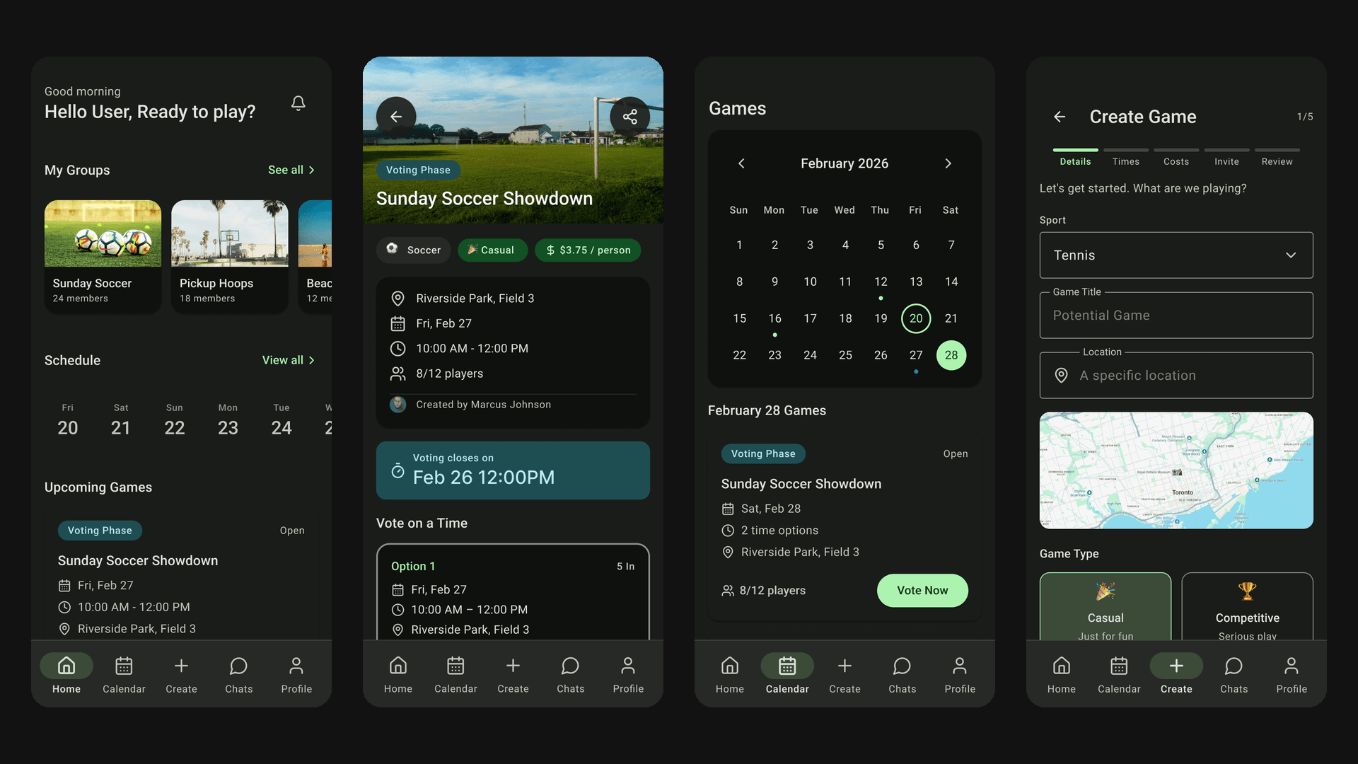
The app is 11 screens under a persistent 5-tab bottom bar.
| Tab | What it holds |
|---|---|
| Home | Greeting, "My Groups", upcoming schedule, game cards with status badges |
| Calendar | Monthly view with dotted indicators for proposals and solid ones for confirmed games |
| Create | The five-step Create Game wizard |
| Messages | Groups and Direct tabs, with new proposals posted inline as system messages |
| Profile | Player stats (games played, weeks played) plus group and notification settings |
The Game Page sits outside the tab structure and is reachable from Home, Calendar, or Messages. It's where voting actually happens.
Home Calendar Create Messages Profile
The Create Game Wizard
Creation is split across five steps so each screen handles one concern instead of stacking everything into a single long form.
| Step | Concern |
|---|---|
| 3.0 Details | Sport, title, address, Casual vs. Competitive, max players |
| 3.1 Time & Location | Up to 5 option cards with date, start/end time, address |
| 3.2 Costs | Total venue cost, split toggle, live per-person estimate |
| 3.3 Invite Players | Copy link, social share, player search, suggested players |
| 3.4 Review & Post | Full summary, visibility selector, group assignment, Create CTA |
3.0 Details 3.1 Time & Location 3.2 Costs 3.3 Invite 3.4 Review & Post Posted
Designing the Voting System
Voting carries the whole app, so it had to cost almost nothing to do.
Options rank themselves by In votes Cost, roster and Confirm My Votes
| Vote | Label | Interaction |
|---|---|---|
| In | I'm In | Single tap. Option card highlights green. |
| Maybe | Maybe | Tap opens a bottom sheet to capture a reason (e.g. "work schedule") |
| Out | Can't | Single tap. Option card grays out. |
A countdown timer at the top of the Game Page keeps proposals from sitting open indefinitely. Options sort themselves by "In" votes so the leading choice is always at the top, and each option card carries its location, date and time, voter avatars, and cost estimate. A "Propose new time" link at the bottom keeps the flow open when none of the options work for someone.
The asymmetry between the three votes is deliberate. In and Out are a single tap because they're unambiguous. Maybe costs an extra step, because a maybe with no reason attached tells the organizer nothing.
Status Lifecycle
proposal → confirmed → completed / cancelled
| Status | Visual treatment |
|---|---|
| Proposal | Blue badge, countdown visible, voting enabled |
| Confirmed | Green badge, winning option highlighted, attendance toggle |
| Completed | Gray badge, read-only, stats recorded |
| Cancelled | Red badge, dismissed from calendar and dashboard |
Proposal Confirmed Completed
Mobile Design Decisions
The prototype uses a dark theme with green accents, which suits the sport context and gives the status colors room to read clearly. Green means confirmed or in, blue means proposal, yellow means maybe, red means cancelled or out, so you can scan a game's state without reading the badge text.
Everything interactive clears 44x44pt. A mistap on a vote button is worse than a normal misfire when the entire interaction is meant to be one tap. Secondary actions like entering a Maybe reason or opening option details happen in bottom sheets, which keeps the primary screens clear. Every frame includes the iOS status bar and respects the bottom safe area, and the wizard steps slide left and right so forward progress reads without a label.
AI-Assisted Design Process
Part of the point of this project was seeing how far an AI-assisted pipeline could carry a design from spec to shipped product.
Notion spec → Figma Make → GitHub → Claude Code → Figma MCP bridge → manual polish
One detailed Notion spec page acted as the source of truth for every tool in that chain. It made prompting far more effective and kept four project phases pointing in the same direction.
Where the work landed
AI carried the first draft. I carried the judgment.
- AI handled70%
Layout, placeholder content, scaffolding, consistency, code-to-design bridging
- Human judgment30%
Theme, state logic, prototype wiring, mobile conventions, accessibility
Approximate split, my own estimate from the project.
| AI handled (~70%) | Human judgment (~30%) |
|---|---|
| First-pass layout generation | Dark theme + green accent system |
| Realistic placeholder content (real names, times, scores) | Component state logic (status badges, vote states) |
| Repetitive component scaffolding | Interactive prototype wiring |
| Code-level consistency | Mobile convention enforcement |
| Bridging code ↔ design via MCP | Usability and accessibility validation |
Figma Make produced usable first-pass layouts but kept missing mobile fundamentals like safe areas, minimum touch targets, and state variants. The generated screens looked more finished than they were.
Building the Live Prototype
Rather than stopping at a Figma prototype, I built and hosted a working version of OptIn that people could sign into and use. It runs on React with Supabase behind it for authentication, a Postgres database, and real-time subscriptions.
What works: authentication with persistent sessions, game creation with multi-option proposals, and voting that updates live for everyone in the game. Data persists across accounts, so what Player A does shows up for Player B without a refresh.
Cross-account persistence was the hardest part of that. A game created by one player has to be visible, votable, and immediately up to date for everyone else, and getting the sync right took several passes. After that came the voting edge cases the spec never anticipated: duplicate invitations, votes arriving before the full roster had loaded, and a countdown expiring with no option confirmed. In-app chat is still a work in progress and got deprioritized against core voting reliability.
None of those problems appeared in the spec or in the Figma prototype. They only showed up once the app was in real use, which is the argument for getting something testable into people's hands early.
Feedback & Iteration
A peer reviewer flagged the browsing experience:
Filtering and search are still on the list, but the change I could make immediately was to the Calendar. Tapping a date with no games used to show a static "No games on this date" message and nothing else, so the user had to back out and find the Create tab on their own. That empty state now carries a "+ Create Game" button that pre-fills the selected date. Small change, but it removes a dead end from browsing and wires the calendar straight into the creation flow.
Scope Decisions
| Change | Reason |
|---|---|
| Reduced scope and user complexity; rating teammates adds social friction to a casual app | |
| Attendance stats kept on Profile | Display-only lightweight version of reliability, without the rating system |
| Chat deprioritized | Core voting reliability mattered more than a second messaging surface |
Outcomes & Learnings
11
hi-fi mobile screens with state variants
5
tabs in the persistent bottom bar
3
vote states: In, Maybe, Can't
4
project phases, concept to live app
What Shipped
- 11 hi-fi mobile screens with state variants, wired up as an interactive Figma prototype
- A live hosted web app with real authentication, persistence, and multi-user voting
- A full path from concept to wireflow to hi-fi design to functional product across four project phases
What I Learned
The Part 2 wireframes turned out to be the thing everything else was built on. Because the flows were settled early, the later phases were refinement rather than redesign.
Mobile conventions are the kind of work nobody notices when it's right. Touch targets, safe areas, and bottom sheets earn no credit for being correct, but a screen that gets them wrong feels off immediately.
AI got me to a testable artifact quickly and then stopped being much help. Visual identity, interaction logic, and accessibility were all manual. The speedup is real, but it applies to the first draft rather than to the finished product.
The Notion spec page was probably the highest-value artifact of the whole project. It made every AI tool more useful and kept four phases coherent. If I were advising someone starting a similar project, that's the part I'd tell them to do first.
Next Steps
- Finish group and direct chat
- Push notifications, the most important missing piece, since voting depends on people responding in time
- Geolocation and maps for venue previews and one-tap directions
- Deep links and social sharing, so an invite opens straight to the Game Page without requiring an account to view it
- Calendar API integration to add confirmed games to Google or Apple Calendar automatically
- Accessibility work: ARIA labels, high-contrast mode, screen reader and voice control support
- A React Native build for native push notifications and possible wearable support